Top Must Have VST Plugins and Virtual Synthesizers
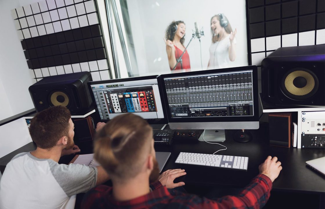
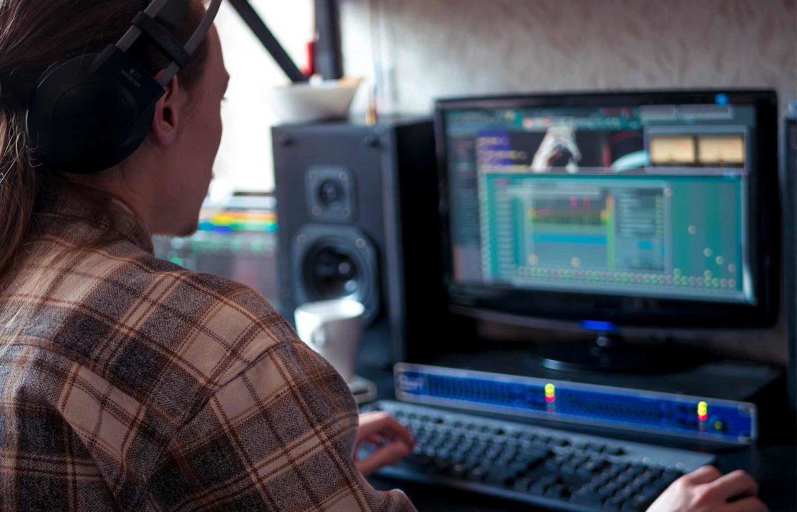
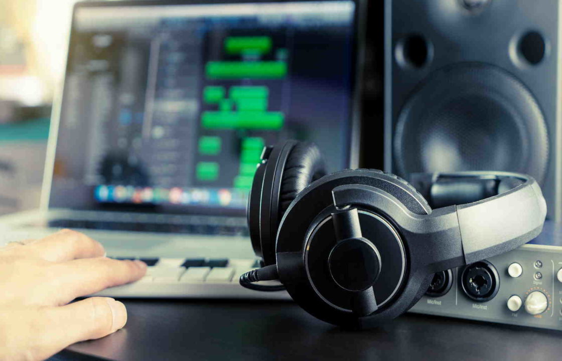
Plugins and synthesizers are two things that are critical for every music composer’s studio (to be precise, it’s their virtual studio and not even a real one). Without these two add-on features, VST (Virtual Studio Technology) is incomplete. These plugins give a lot of flexibility in terms of creation and processing of music. But why do you need a v …